Why Doesn't My Print Match My Screen?
Calibration Print & Screen Check
Have you ever wondered why an image you have printed sometimes never quite matches what you see on your screen? If you have spent time editing your images and you want to reproduce them with some degree of colour accuracy, then some form of screen calibration is required.
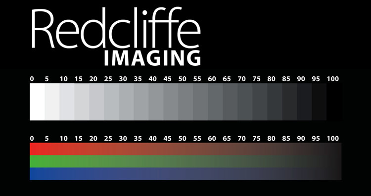
For those whose only concern is to ensure that what they see on their screen will be reasonably close to what they have printed, then a quick check with the calibration image below will give you some reassurance that the monitor you use is close to aim or not.
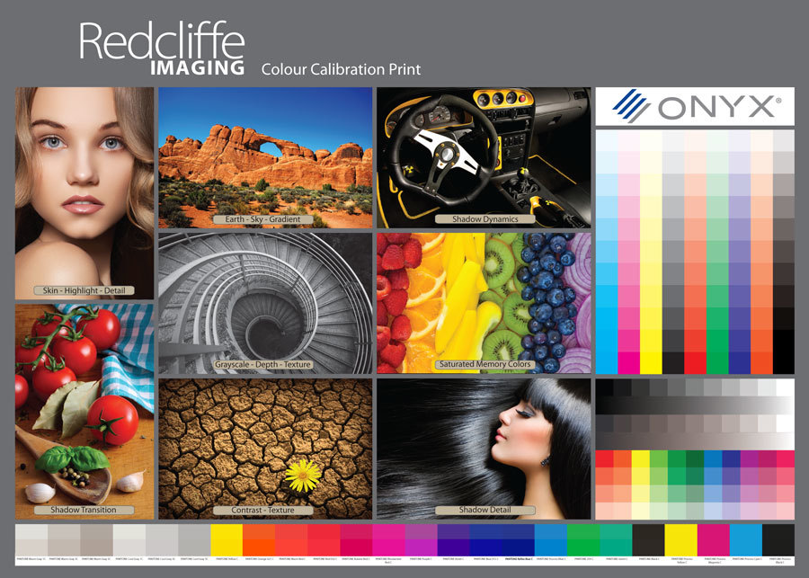
Calibration Print
Better still, order a calibration print from Redcliffe Imaging and compare it directly with the calibration image on the screen. You will quickly see if there are any issues that might affect how your screen is displaying image tones and colours.
We include a Calibration Print with each Fine Art Media Sample Pack.
Click here to order your Fine Art Media Sample Pack:
How To Use
- Download a copy of the Colour Calibration Print File (PDF)
- Open this file on your computer and compare it to the Calibration Print you received in your Fine Art Media Sample Pack.
- When looking at your Calibration Print try to view it in as natural a light as possible. Sunlight, even on a cloudy day provides the best and most accurate viewing circumstance.
If you have done these visual checks and you are happy with the result from your screen then you can be reasonably assured that what you see on your screen will be close to what you have printed at Redcliffe Imaging.
Remember that your screen can show a much larger range of colours than any print can achieve. For example bright reds and deep blues often get clipped and will print less saturated than they appear on your screen, this is because certain colours may be out of range for CMYK printing.
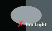
A Quick Screen Check Helps
Screen Check - Is your monitor set too dark or too light? Look at the middle square and you should just make out the dark grey oval set on the black background.


If you require a very high degree of colour accuracy then a device such a colorimeter automatically brings the colour output of your monitor in line with standards set by the International Color Consortium.
For those whose only concern is to ensure that what they see on their screen will be reasonably close to what they have printed, then a quick check with the image below will give you some reassurance that the monitor you use is close to aim or not.
- The first thing to look at is the greyscale, do you see the steps from 0 to 100, which represents pure white to pure black. You should barely see the break line between steps 95 to 100.
- The Red Green Blue spectrum should be visible without any steps, if you can see stepping rather than a continuous tone then you are not viewing with the maximum colour available. You can adjust the number of colours that your screen displays to show from 256 to millions of colours.